Do you like your housing market data and graphs? Yes, then feast your eyes on this little lot, jam-packed into a short article courtesy of the BBC.
First-time buyers – where have they been and where are they now?
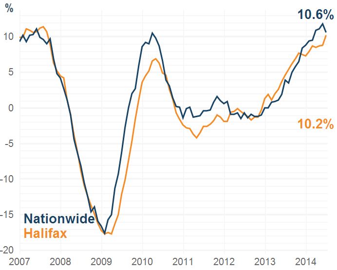
House prices – what are the trends?
Ownership & tenure breakdown – across Europe – want to know who wins the home ownership equivalent of Eurovision [spoiler alert: look east]?
House-building starts & completions – are they up, down and sufficient enough to plug the gap?
Population vs. housing stock growth – talking of the gap…is it getting bigger or smaller?
Household numbers and size projections – what will we need and who will we be living with in the next decade?
It’s all in here so, kick off your shoes, grab yourself a drink, sit back and relax for 10 minutes and just enjoy the ride…or am I just the only sad one I wonder?
Source: www.bbc.co.uk 3rd September 2014